
Custom Homepage
Overview
The theme provides a highly flexible approach to customizing the homepage. You can tailor your homepage according to your specific requirements.
The theme defines your homepage through frontmatter. Write the frontmatter in the README.md file located in your sourceDir.
---
home: true
config:
  - type: custom
---
The theme follows a flow layout approach to render the homepage, dividing it vertically into distinct, independent sections, with each section applying a different component.
Multiple sections can be defined via the config property using an array structure. The type field specifies the type of each section. The theme includes built-in types such as banner, hero, text-image, image-text, features, profile, and custom. You can freely combine these to assemble your custom homepage. If none of these meet your needs, you can also write custom components to define your homepage.
Configuration
home
- Type:
boolean
Declares whether this page is the homepage.
config
- Type:
PlumeHomeConfig[] - Default:
[]
Defines the section content of the page based on the order of the array.
interface PlumeHomeConfigBase {
  /**
   * The type of this section, which determines the component applied.
   */
  type: 'banner' | 'hero' | 'text-image' | 'image-text' | 'features' | 'profile' | 'custom' | string
  /**
   * Whether this section should occupy the full viewport height.
   */
  full?: boolean
  /**
   * The background image for this section.
   * You can define different images for light and dark modes.
   */
  backgroundImage?: string | { light: string, dark: string }
  /**
   * The background attachment style for this section.
   */
  backgroundAttachment?: 'fixed' | 'local'
}
Section Types
banner
- Type:
PlumeThemeHomeBanner
A large banner section, suitable for placement at the very top of the homepage.
interface PlumeThemeHomeBanner extends PlumeHomeConfigBase {
type: 'banner'
/**
* The large background banner image.
*/
banner?: string
/**
* Value range: 0 - 1. Configures the opacity of the mask overlay for the homepage banner image.
* Supports different values for light and dark modes. When set to 0, the mask is not displayed.
* This can be used to darken the image if the first-screen banner is too bright.
*/
bannerMask?: number | { light?: number, dark?: number }
hero?: {
name: string
tagline?: string
text?: string
actions?: {
theme?: 'brand' | 'alt'
text: string
link?: string
}
}
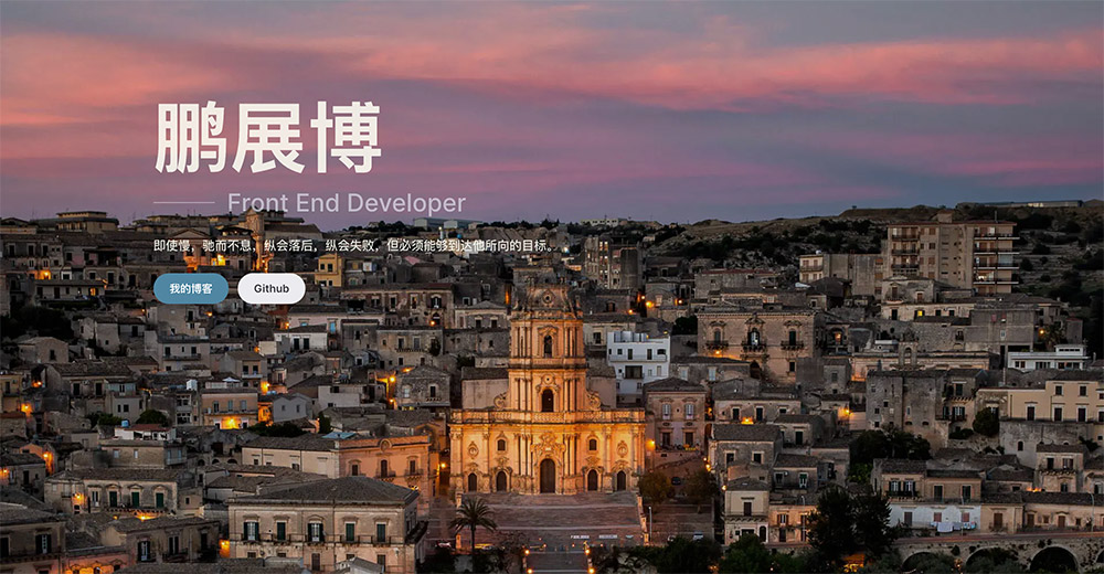
}Example:
---
home: true
config:
  -
    type: banner
    banner: https://api.pengzhanbo.cn/wallpaper/bing
    bannerMask:
      light: 0.1
      dark: 0.3
    hero:
      name: Peng Zhanbo
      tagline: Front End Developer
      text: Even if slow, stop not, even if failed, keep going, but must be able to reach the goal he aims for.
      actions:
        -
          text: My Blog
          link: /blog/
          theme: brand
        -
          text: Github
          link: https://github.com/pengzhanbo
          theme: alt
---
Result:
hero
- Type:
PlumeThemeHomeHero
Suitable for documentation-type sites, placed at the top.
interface PlumeThemeHomeHero extends PlumeHomeConfigBase {
  type: 'hero'
  hero: {
    name: string
    tagline?: string
    text?: string
    actions?: {
      theme?: 'brand' | 'alt' | 'sponsor'
      text: string
      link?: string
      icon?: string // Icon to the left of the text
      suffixIcon?: string // Icon to the right of the text
      target?: '_blank' | '_self' | string
      rel?: string
    }
  }
  /**
   * The built-in background effects of the theme, if they are not preset background effects, allow for a background image link address to be passed in.
   */
  effect?: 'tint-plate' | 'prism' | 'pixel-blast' | 'hyper-speed' | 'liquid-ether'
    | 'dot-grid' | 'iridescence' | 'orb' | 'beams' | 'lightning' | string
  /**
   * Background effect configuration options vary depending on the value of `effect`.
   */
  effectConfig?: any
  /**
   * If using a non-preset background, set the filter effect for the background image.
   */
  filter?: string
}
See Background Effects Configuration & Demo to learn more.
The theme also supports customizing the colors of name, tagline, and text.
Configure this via CSS Variables.
/* Default settings, can be overridden in `index.css` */
:root {
  /* home hero name background color. The text color is defined via background clipping,
     allowing gradient backgrounds for more expressive text. */
  --vp-bg-home-hero-name: linear-gradient(315deg, var(--vp-c-purple-1) 15%, var(--vp-c-brand-2) 65%, var(--vp-c-brand-2) 100%);
  --vp-c-home-hero-tagline: var(--vp-c-text-2);
  --vp-c-home-hero-text: var(--vp-c-text-3);
}
doc-hero
- Type:
PlumeThemeHomeDocHero
Suitable for documentation-type sites, placed at the top.
interface PlumeThemeHomeDocHero {
type: 'doc-hero'
hero: {
name: string
tagline?: string
text?: string
image?: string
| { src: string, alt?: string }
| { dark: string, light: string, alt?: string }
actions?: {
theme?: 'brand' | 'alt' | 'sponsor'
text: string
link?: string
icon?: string // Icon to the left of the text
suffixIcon?: string // Icon to the right of the text
target?: '_blank' | '_self' | string
rel?: string
}
}
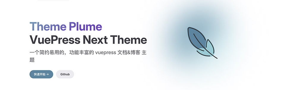
}Example:
---
home: true
config:
  -
    type: doc-hero
    hero:
      name: Theme Plume
      text: VuePress Next Theme
      tagline: A minimalistic, easy-to-use, feature-rich vuepress documentation & blog theme
      image: /plume.png
      actions:
        -
          theme: brand
          text: Get Started →
          link: /guide/intro/
        -
          theme: alt
          text: Github
          link: https://github.com/pengzhanbo/vuepress-theme-plume
---
Result:
The theme also supports customizing the colors of name, tagline, text, and the background color of the image.
Configure this via CSS Variables.
/* Default settings, can be overridden in `index.css` */
:root {
  --vp-home-hero-name-color: transparent;
  --vp-home-hero-name-background: linear-gradient(120deg, var(--vp-c-purple-1) 30%, var(--vp-c-brand-2));
  --vp-home-hero-tagline: var(--vp-c-text-2);
  --vp-home-hero-text: var(--vp-c-text-1);
  --vp-home-hero-image-background-image: linear-gradient(-45deg, var(--vp-c-brand-soft) 50%, var(--vp-c-brand-2) 50%);
  --vp-home-hero-image-filter: blur(44px);
}
features
- Type:
PlumeThemeHomeFeatures
Suitable for displaying features, functionalities, etc.
interface PlumeThemeHomeFeatures extends PlumeHomeConfigBase {
type: 'features'
title?: string
description?: string
features: PlumeThemeHomeFeature[]
}
interface PlumeThemeHomeFeature {
/**
* Icon, also supports passing an iconify icon name.
*/
icon?: FeatureIcon
title: string
details?: string
link?: string
linkText?: string
rel?: string
target?: string
}
type FeatureIcon = string | {
src: string
alt?: string
width?: string
height?: string
wrap?: boolean
} | {
light: string
dark: string
alt?: string
width?: string
height?: string
wrap?: boolean
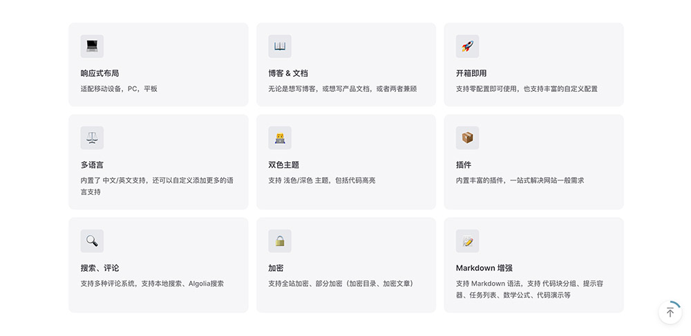
}Example:
---
home: true
config:
-
type: features
features:
-
title: Responsive Layout
icon: 💻
details: Adapts to mobile devices, PCs, and tablets.
-
title: Blog & Documentation
icon: 📖
details: Whether you want to write a blog, product documentation, or both.
-
title: Out of the Box
icon: 🚀
details: Supports zero-configuration usage, along with rich customization options.
-
title: Multi-language
icon: ⚖
details: Built-in support for Chinese/English, with the ability to add more languages.
-
title: Dual Theme
icon: 👨💻
details: Supports light/dark themes, including code highlighting.
-
title: Plugins
icon: 📦
details: Rich built-in plugins to handle common website needs in one place.
-
title: Search, Comments
icon: 🔍
details: Supports multiple comment systems, local search, and Algolia search.
-
title: Encryption
icon: 🔒
details: Supports full-site encryption, partial encryption (encrypted directories, encrypted articles).
-
title: Markdown Enhancements
icon: 📝
details: Supports Markdown syntax, code block groups, hint containers, task lists, mathematical formulas, code demos, etc.
---Result:
text-image | image-text
- Type:
PlumeThemeHomeTextImage
Left-right layout for text and image.
interface PlumeThemeHomeTextImage extends PlumeHomeConfigBase {
  type: 'text-image' | 'image-text'
  image: PlumeThemeImage
  width?: number | string
  title?: string
  description?: string
  list: (string | { title?: string, description?: string })[]
}

type PlumeThemeImage
  = | string
    | { src: string, alt?: string }
    | { dark: string, light: string, alt?: string }
Example:
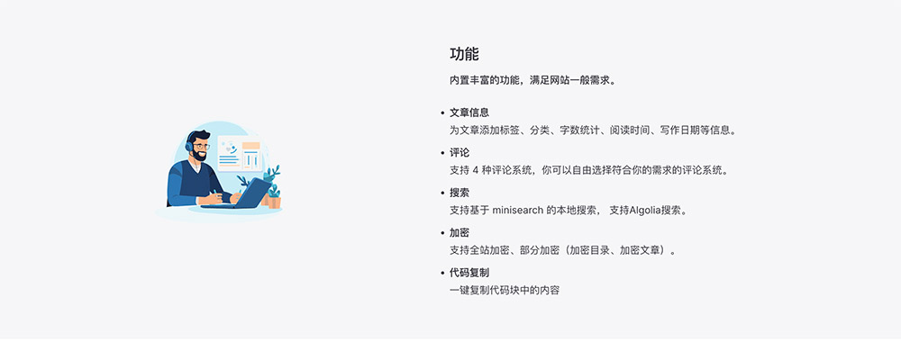
---
home: true
config:
-
type: image-text
title: Features
description: Rich built-in features to meet general website requirements.
image: /images/plume-1.svg
list:
-
title: Article Information
description: Add tags, categories, word count, reading time, writing date, and other information to articles.
-
title: Comments
description: Support for 4 comment systems, allowing you to freely choose the one that fits your needs.
-
title: Search
description: Supports minisearch-based local search and Algolia search.
-
title: Encryption
description: Supports full-site encryption and partial encryption (encrypted directories, encrypted articles).
-
title: Code Copy
description: One-click copying of code block content.
-
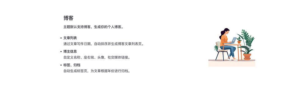
type: text-image
title: Blog
description: The theme natively supports blogging, generating your personal blog.
image: /images/plume-2.svg
list:
-
title: Article List
description: Automatically sorts and generates blog article list pages based on writing dates.
-
title: Author Information
description: Customize name, motto, avatar, and social media links.
-
title: Tags, Archive
description: Automatically generates tag pages and archives articles by year.
---Result:
posts
Inserts a post collection article list page as a separate section into the homepage.
interface PlumeThemeHomePosts extends PlumeHomeConfigBase {
  type: 'posts'
  collection?: string
}
When multiple post collections exist, it reads the article list from the first collection by default. You can specify which collection's article list to read using the collection configuration option.
The value of collection should match the dir value of the collection.
Example:
---
home: true
config:
  -
    type: posts
    collection: blog
---
profile
- Type:
PlumeThemeHomeProfile
Displays personal information.
interface PlumeThemeHomeProfile extends PlumeHomeConfigBase {
  type: 'profile'
  name?: string
  description?: string
  avatar?: PlumeThemeImage
  circle?: boolean
}

type PlumeThemeImage
  = | string
    | { src: string, alt?: string }
    | { dark: string, light: string, alt?: string }
Example:
---
home: true
config:
-
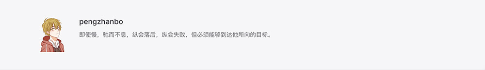
type: profile
name: pengzhanbo
description: Even if slow, stop not, even if failed, keep going, but must be able to reach the goal he aims for.
avatar: /images/avatar.png
---Result:
custom
- Type:
PlumeThemeHomeCustom
Custom content. The markdown content written in the README.md file will be inserted into the corresponding section.
interface PlumeThemeHomeCustom extends PlumeHomeConfigBase {
  type: 'custom'
}
Example:
---
home: true
config:
-
type: custom
---
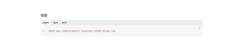
### Installation
:::code-tabs
@tab pnpm
```sh
pnpm add vuepress@next vuepress-theme-plume vue
```
@tab npm
```sh
npm install vuepress@next vuepress-theme-plume
```
@tab yarn
```sh
yarn add vuepress@next vuepress-theme-plume
```
:::Result:
Custom Section Types
When the built-in section types are insufficient for your needs, you can create custom section types.
Each custom section type is essentially a component.
A simple example is as follows:
your-component.vue
<script setup lang="ts">
import type { ThemeHomeConfigBase } from 'vuepress-theme-plume'
import { VPHomeBox } from 'vuepress-theme-plume/client'

const props = defineProps<ThemeHomeConfigBase & {
  // Component props, properties from frontmatter will be passed to the component
}>()
</script>

<template>
  <VPHomeBox
    :type="type"
    :background-image="backgroundImage"
    :background-attachment="backgroundAttachment"
    :full="full"
  >
    <!-- Customize your content -->
    <div>...</div>
  </VPHomeBox>
</template>
Add the component in the enhance hook within .vuepress/client.ts
.vuepress/client.ts
import { defineClientConfig } from 'vuepress/client'
import YourComponent from 'your-component.vue'

export default defineClientConfig({
  enhance({ app }) {
    app.component('your-component', YourComponent)
  },
})
Then, you can use your-component in your README.md.
---
home: true
config:
  -
    type: 'your-component'
    # ...
---
